With the final edits for The Redemption of Erâth: Exile wrapping up, I’m starting to look at the internal design of the book. When I published Consolation, I had a publishing company to do all the design work, and I have to say that for the internal design, at least, they did a pretty good job.
This time, though, I’m on my own. I got some practice in when I published the History of Erâth in October, so I know a few things to look out for (for example, good guttering), but since this is a major sequel (the second ‘true’ book in the series), I really want to make sure everything comes out just right. I’m going to try a few different print options—I went for cream paper with History of Erâth, but I wasn’t entirely satisfied with the stock (it’s a little too thin). I might test white paper, and see if the stock is any better.
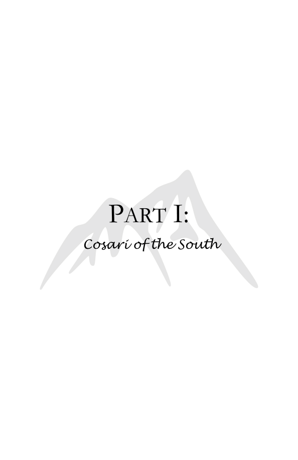
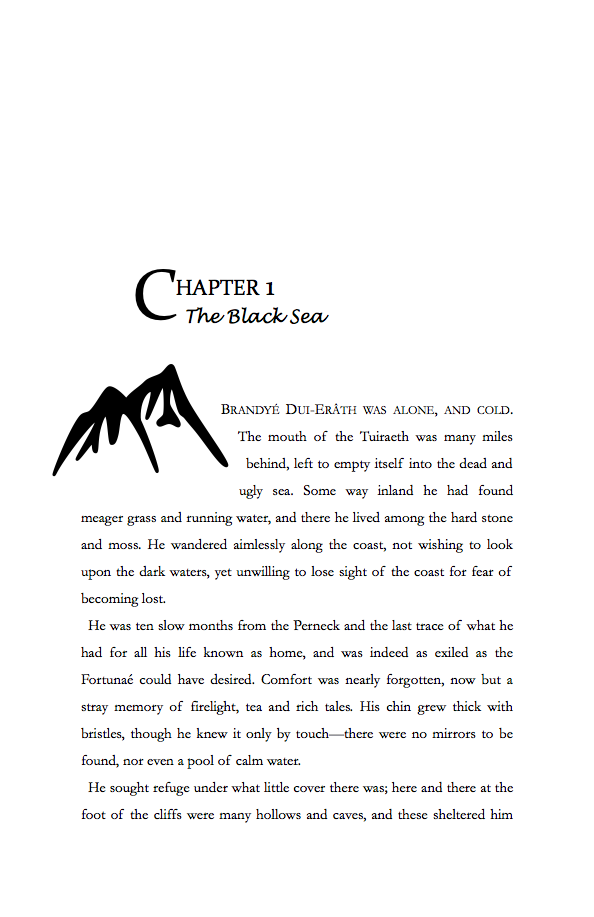
I also want an internal design to match the first two books—fire for Consolation, trees and leaves for History. The major theme throughout Exile is mountains, so I’ve designed a couple of black and white mountain silhouettes to try and replicate the feel of the first two books. I use them for Part pages and for Chapter headings, and to separate sections of the book. Below are some examples of what this looks like:
I’d love honest feedback on these; I’m open to changes at the moment, but pretty soon it’s going to have to be fixed and locked in. If there’s room for improvement, please let me know!


